%%{
  init: {
    'theme': 'base',
    'themeVariables': {
      'primaryColor': '#FFC20E',
      'primaryTextColor': '#000000',
      'primaryBorderColor': '#2D2926',
      'lineColor': '#2D2926',
      'secondaryColor': '#2D2926',
      'secondaryTextColor': '#000000',
      'tertiaryColor': '#F2F2F2',
      'tertiaryBorderColor': '#2D2926'
    }
  }
}%%

flowchart LR
  A(have a <br>question) --> B(get data)
  B --> B2(select <br>variables)
  B2 --> C(process and <br>clean data)
  C --> D(visualize <br>data)
  D --> E(analyze <br>data)
  E --> F(make <br>conclusions)
  F --> G(share <br>ideas)
5 A Quick Introduction To ggplot2
5.1 Why Use ggplot?1
A great deal of data analysis and visualization involves the same core set of steps: get some data, clean it up a little, run some descriptive statistics, run some bivariate statistics, create a graph or a visualization. ggplot2 (Wickham, 2016) can be an important part of a replicable, automated, documented workflow for complex projects.
Given the fact that we often want to apply the same core set of tasks to new questions and new data, there are ways to overcome the steep learning curve and learn a replicable set of commands that can be applied to problem after problem.
The same 5 to 10 lines of ggplot2 code can often be tweaked over and over again for multiple projects.
5.2 The Essential Idea Of ggplot Is Simple
There are 3 essential elements to any ggplot call:
- A reference to the data you are using.
- An aesthetic that tells
ggplotwhich variables are being mapped to the x axis, y axis, (and often other attributes of the graph, such as the color, * color fill, or even the shape, size, transparency, or line type*). Intuitively, the aesthetic can be thought of as what you are graphing. - A geom or geometry that tells ggplot about the basic structure of the graph. Intuitively, the geom can be thought of as how you are graphing it.
You can also add other options, such as a graph title, axis labels and overall theme for the graph.
5.3 Get Started
5.3.1 Call Libraries
library(ggplot2) # beautiful graphs

library(ggthemes) # nice themes for ggplot2
5.3.2 Get Data
load("./simulate-data/MICSsimulated.RData") # data in R format5.4 Some Examples2
5.4.1 One Continuous Variable
# anything that starts with a '#' is a comment

ggplot(MICSsimulated, # the data I am using
       aes(x = GII)) + # the variable I am using
  geom_histogram() # how I am graphing it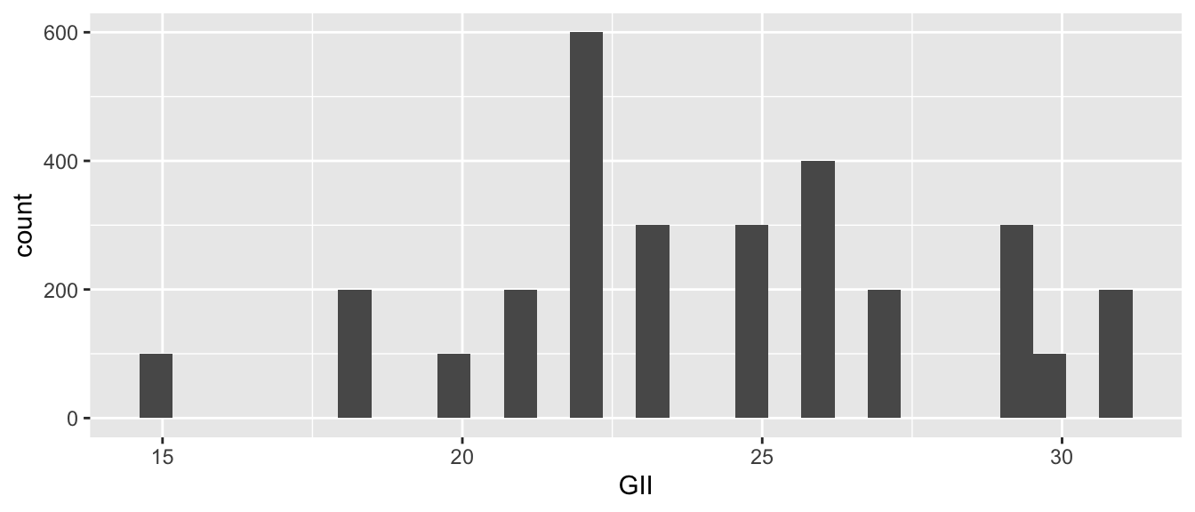
We can add color and a theme.
# anything that starts with a '#' is a comment

ggplot(MICSsimulated, # the data I am using
       aes(x = GII)) + # the variable I am using
  geom_histogram(fill = "#1CABE2") + # how I am graphing it
  theme_minimal()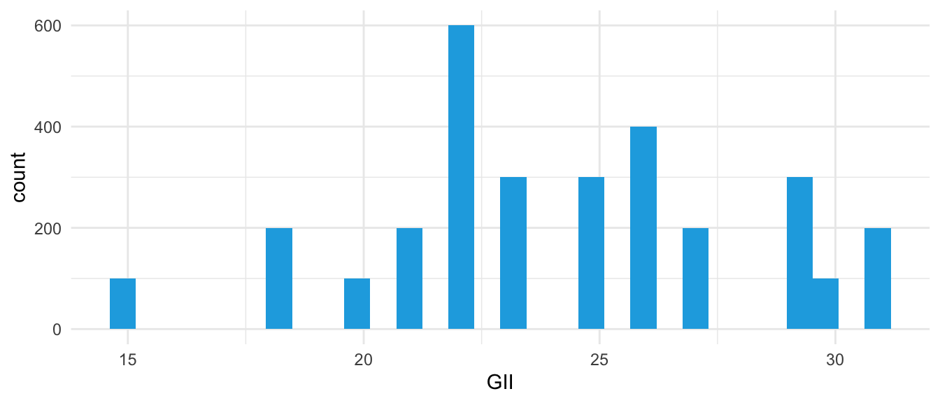
5.4.2 One Categorical Variable
Make sure R knows aggression is a categorical variable.
MICSsimulated$aggression <-
  factor(MICSsimulated$aggression, # original numeric variable
         levels = c(0, 1),
         labels = c("no aggression", "aggression"),
         ordered = TRUE) # whether order matters
Now make the graph.
ggplot(MICSsimulated, # the data I am using
       aes(x = aggression)) + # the variable I am using
  geom_bar() # how I am graphing it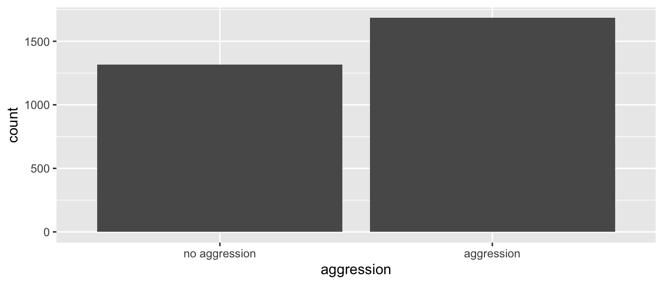
We can add color and a theme.3
ggplot(MICSsimulated, # the data I am using
       aes(x = aggression, # x is aggression
           fill = aggression)) + # fill is also aggression
  geom_bar() + # how I am graphing it
  theme_minimal()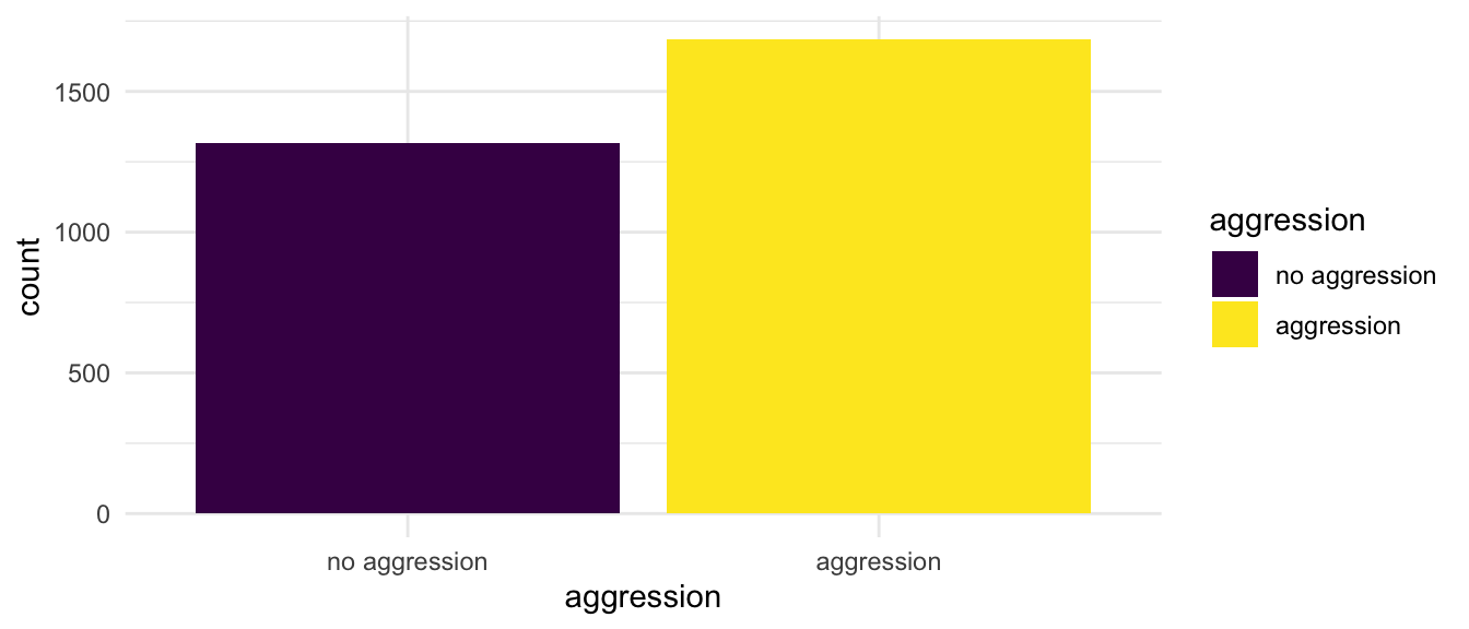
5.5 Make a More Complex Graph4
Make sure R knows cd1 is a categorical variable.
MICSsimulated$cd1 <-
  factor(MICSsimulated$cd1, # original numeric variable
         levels = c(0, 1),
         labels = c("no spank", "spank"),
         ordered = TRUE) # whether order matters
Now make the graph.
ggplot(MICSsimulated, # the data I am using
       aes(x = cd1, # x is spanking
           fill = aggression)) + # fill is aggression
  geom_bar(position = position_dodge()) + # graph with "dodged" bars
  labs(title = "Spanking and Aggression",
       x = "spanking",
       y = "count") +
  scale_fill_manual(values = c("#1CABE2", # UNICEF colors
                               "#D8D1C9")) +
  theme_minimal()  # theme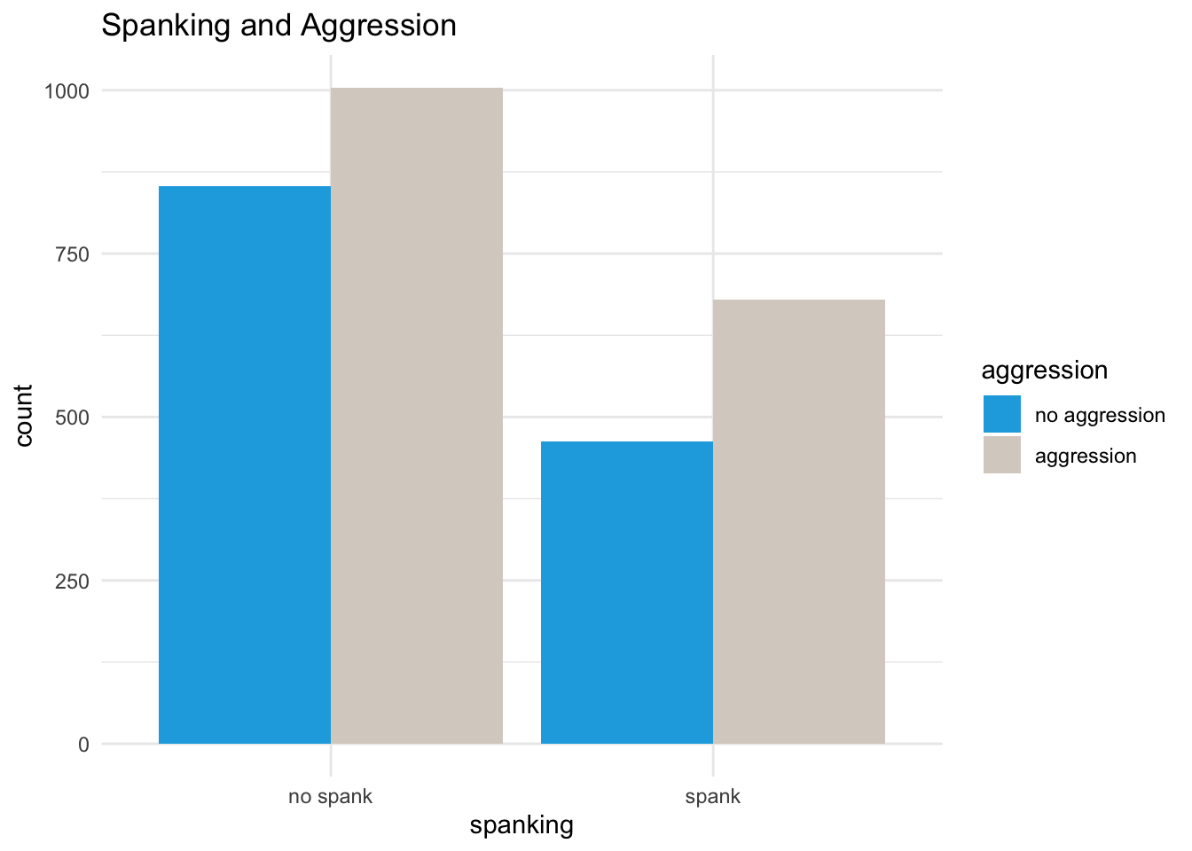
Tip
An interactive tutorial to create this plot can be found here.
More information can be found here: https://agrogan1.github.io/R/introduction-to-ggplot2/introduction-to-ggplot2.html↩︎
Changing variables from factor to numeric (e.g.
aes(x = as.numeric(outcome))), and vice versa can sometimes be a simple solution that solves a lot of problems when you are trying to graph your variables.↩︎Notice how use of
fillgoverns both the color fill in the graph below, as well as the legend that is produced in the graph.↩︎Notice how use of
fillgoverns both the color fill in the graph below, as well as the legend that is produced in the graph.↩︎